This article follows on from the related article on Animation using CSS Transforms and investigates the transition-duration and transition-timing-function properties which control, respectively, the duration and speed at which a transition is carried out.
The examples on this page will currently only work if you download a WebKit Nightly Build web browser now work in Safari 5, Chrome 6, Opera 10 and Firefox 4 Beta. They will not work in Internet Explorer.
1. Transition Timing Function Options
The transition-duration property is simple to understand. It defines the total duration of a transition from state A to state B, whether the transition involves scaling, distorting, rotating or modifying the style of an element.
The transition-timing-function is more difficult as it defines the rate at which the transition is carried out, which can involve speeding up and slowing down. It's all got something to do with Bézier curves as described here:
The transition-timing-function property describes how the animation will proceed over time. Keywords can be used for common functions or the control points for a cubic bézier function can be given for complete control of the transition function.
Rather than trying to work out what all that means, lets look at the keyword values for this property and how they affect a simple translation across the page. Move your mouse over the field below and the green boxes should all take off in a race across the page.
Each box undergoes the same transformation, but they all use different transition timing functions as shown by their labels. These are explained in more details below.
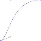
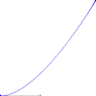
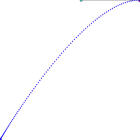
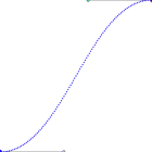
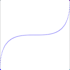
| default » linear » ease-in » ease-out » ease-in-out » cubic-bezier » You can certainly see the effect of different transition timing functions on the animation. Of the named functions the ease-out box is fastest out of the blocks with ease-in lagging at the back. The default setting seems to be a slightly accelerated version of ease-in-out. And all of them complete the trip at more or less the same 2 seconds. The cubic-bezier option let's you specify your own curve by defining two points. The curves used for the above display are illustrated in the next section, apart from linear which I hope speaks for itself. 2. What are Bézier Curves?The model used to generate different timing functions is based on cubic bézier curves which are described in the Surfin' Safari blog as follows: To specify a cubic bezier function, you give an X and Y values for 2 of the control points of the curve. Point P0 is implicitly set to (0,0) and P3 is implicitly set to (1,1). These 4 points are used to compute a cubic bezier curve. In the same article they provide the values used to generate the 'named' options which allow us to illustrate the different curves. Below each graph you can see the name of the timing function and the coordinates of P1 and P2 used to plot the curve. For the last curve we've defined the coordinates ourselves using the cubic-bezier option:
The mechanics of Bézier curves are described in detail on Wikipedia as follows: Four points P0, P1, P2 and P3 in the plane or in three-dimensional space define a cubic Bézier curve. The curve starts at P0 going toward P1 and arrives at P3 coming from the direction of P2. There's a bit more to it than that of course as you can find out on that page, but what's important is that you see how the five graphics above match the movements of the five boxes in the previous section. The x-axis represents time and the y-axis the displacement (horizontal in this case). These graphs have been generated using BezierText 1.0.1 (freeware) for OSX 3. Now available in SafariAs of Safari 3.1 (March 2008) these CSS properties are now recognised by default so they work for all up-to-date OSX users. So brace yourself - this could be the scariest addition to the web since animated backgrounds! 4. Image Fade and Special Effects using CSSHere's an interesting use for CSS transitions - a dynamic fade from one photo to another. When you mouseover the photo of Hilary it will fade gracefully into a photo of Barak. Move the mouse away and the transition is repeated in reverse.   Here are the styles used for this effect (no JavaScript required): Here's another interesting effect - a progress bar that counts off 5 seconds in half-second intervals. To start the animation, put your mouse over the line of boxes and wait.
Again, this is achieved using no JavaScript and very little CSS. It's a bit of a hack, but surprisingly effective: Note: to get these examples working in Opera you need to use the -o- prefix instead of (as well as) -webkit-. For Firefox the prefix will be -moz-. So what do you think? Is this the 'Flash killer' that we've been waiting for? |
No comments:
Post a Comment