(24h) - PHP là ngôn ngữ đằng sau một số ứng dụng web mạnh mẽ và phổ biến nhất hiện nay, trong đó có thể kể đến Facebook và WordPress.
Học một ngôn ngữ mới có thể khá khó khăn với nhiều người. Bài viết này giới thiệu với bạn đọc một số lời khuyên quý báu của các chuyên gia PHP dành cho người mới bước chân vào thế giới PHP.
10 lời khuyên cho người mới bắt đầu học PHP, Vi tính - Internet, 10 loi khuyen cho nguoi hoc PHP, 10 loi khuyen, PHP, vi tinh, internet, Python, ung dung web, Facebook, WordPress
1. Elizabeth Naramore: Bắt đầu với OOP
Naramore hiện đang là nhân viên của SourceForge và người sáng lập trang PHPWomen.org. Đối với người vừa mới bắt đầu học PHP, Naramore cho rằng nên có một nền tảng vững chắc trong việc lập trình hướng đối tượng (OO) trước khi tìm hiểu sâu hơn vào PHP.
"Nếu bạn vốn không xuất thân từ lĩnh vực lập trình, hãy dành thời gian để tìm hiểu nguyên tắc căn bản của phát triển phần mềm. Những vấn đề cần chú ý như lập trình hướng đối tượng (OOP), phát triển hướng kiểm thử (test driven development), quản lí phiên bản (version control), gỡ lỗi (debugging), các mẫu thiết kế (design pattern), vv).
"Nếu bạn đã thử và không thể giải quyết vấn đề của bạn, đừng ngại hỏi. Các cộng đồng PHP nói chung rất hữu ích và thân thiện. Có vô số tài nguyên cho những người mới trên mạng. Nhờ đến sự trợ giúp của cộng đồng, cho dù đó là một nhóm người dùng địa phương, một dự án mã nguồn mở của cộng đồng, hay một kênh IRC như #phpc trên freenode".
2. Keith Casey: Hãy Google trước khi hỏi
Casey là chủ của một cửa hàng bán phần mềm và là một diễn giả rất có tiếng trong các cuộc hội thảo lớn về PHP.
Lời khuyên của ông nhấn mạnh việc hãy biết mình đang ở đâu trong cộng đồng PHP cùng với một câu châm ngôn đang ngày càng trở nên quan trọng: Google trước khi hỏi.
"Hãy tham gia ngay vào một nhóm người dùng PHP (PHP User's Group). Có vô số nhóm người dùng PHP ở mọi nơi trên thế giới. Đó là nơi những người thông minh tập hợp để thảo luận, khám phá những ý tưởng, và giúp đỡ lẫn nhau.
"Hãy nhớ thử tìm kiếm trên Google trước khi đặt câu hỏi. Chẳng có ai thích những kẻ lười biếng cả".
3. Eamon Leonard: Tham gia các dự án mã nguồn mở
Leonard điều hành một công ti phần mềm đặt tại Ireland và là đồng sáng lập CloudSplit, một dịch vụ phân tích thời gian thực cho công nghệ điện toán đám mây. Giống như nhiều đồng nghiệp của mình, ông khuyên rằng hãy cố gắng tham gia các dự án mã nguồn mở ngay cả khi mới bắt đầu học PHP.
"Hãy tham gia vào các dự án mã nguồn mở ngay sau khi bạn nắm bắt được các vấn đề cơ bản... Việc này khiến bạn có thể truy cập vào mã nguồn của các dự án và là một cơ hội rất lớn để học hỏi từ các chuyên gia kì cựu trong ngành".
"Tìm và lập tài liệu cho các lỗi có thể tái phát sinh là một nhiệm vụ rất tốn thời gian và được đánh giá cao bởi bất kỳ nhóm phát triển mã nguồn mở nào... Khi thuê các nhà phát triển để làm việc với chúng tôi, chúng tôi sẽ dành nhiều sự ưu ái hơn cho những ai đã từng làm việc trên một dự án phần mềm mã nguồn mở".
4. Lorna Jane Mitchell: Hãy bắt tay vào làm (Just do it)
"Lornajane" là tên gọi phổ biến hơn của Mitchell trên cộng đồng trực tuyến, là một nhà cố vấn, nhà phát triển phần mềm, một tác giả và diễn giả về PHP.
Cô đưa ra một lời khuyên khá nổi tiếng trong giới chuyên môn: Hãy bắt tay vào làm (Just do it).
"Muốn biết bơi thì phải nhảy xuống nước! PHP là một ngôn ngữ rất dễ học. Cách tốt nhất để tìm hiểu xem cái gì đó hoạt động như thế nào là bắt tay vào làm thử.
"Bất cứ ai cũng có thể lập trình PHP. Ít khó khăn khi tham gia có nghĩa là có rất nhiều code PHP tồi trên thế giới. Nhưng những đoạn code PHP tồi mà chạy tốt thì cũng vẫn hữu ích. Cá nhân tôi nghĩ rằng nếu bạn có thể giải quyết vấn đề của bạn với PHP thì cứ mạnh dạn bắt tay vào code ngay cả khi nó chưa hoàn hảo".
5. Chris Cornutt: Tránh những đoạn code rối rắm
Cornutt điều hành PHPDeveloper.org và Joind.in. Ông đã bắt đầu lập trình PHP từ năm 1998. Trong lời khuyên của ông dành những người mới bắt đầu phát triển PHP, ông cảnh báo về những đoạn code rối rắm.
"Tôi nghĩ rằng những phát triển mới sẽ dễ dàng bị chán nản với những đoạn code rối rắm, đau đầu... Những người mới bắt đầu và có một chút thích thú với ngôn ngữ PHP thường rất hăng hái viết code với tâm lí là chỉ cần code chạy được là được, nhưng tôi dám chắc rằng hơn một nửa trong số họ sẽ bỏ cuộc".
"Hãy thử tìm một người cố vấn có thể hướng dẫn bạn một số bước đi ban đầu. Bạn sẽ cảm nhận được một sự khác biệt rất lớn khi bạn có một người nào đó để bàn luận. IRC là một lựa chọn tốt, nhưng một người để có thể gặp mặt để học hỏi sẽ tốt hơn rất nhiều.
Thường họ có rất nhiều các trang web với vô số các đoạn code và các ví dụ PHP đã giúp họ vượt qua những tình huống khó khăn. Một số ví dụ rất hay, một số không có ích nhiều lắm nhưng hãy học chúng một cách dần dần. Phát triển PHP cũng giống như bất cứ điều gì khác, là một kỹ năng mà cần phải được mài giũa - bạn không thể nhảy bụp vào và trở thành một chuyên gia sau một đêm được".
6. Abraham Williams: Học Drupal
Williams là một nhà phát triển và tự gọi mình là một "người ủng hộ các hacker" (hacker advocate). Ông cũng khuyên những người mới lập trình PHP nên tham gia vào các dự án lập trình mã nguồn mở.
"Tìm một dự án hoặc cộng đồng chất lượng (tốt nhất là các dự án phát triển theo định hướng mã nguồn mở) để đóng góp vào. Tìm hiểu về các đoạn mã, con người và văn hóa riêng của dự án đó. Bạn sẽ học hỏi được từ các nhà phát triển có kinh nghiệm, niềm đam mê với những đoạn code chất lượng cùng với một cộng đồng thân thiện. Những người mới sẽ nhận được nhiều hơn từ việc đề xuất các đoạn code cải tiến trong các bản vá và thậm chí từ việc làm thế nào để là một thành viên cộng đồng tốt hơn".
"Tôi cho rằng các dự án Drupal là một điểm khởi đầu tốt. Đó là một cộng đồng trưởng thành và hùng hậu, có tốc độ tăng trưởng mạnh mẽ. Ngoài ra, có rất nhiều cơ hội việc làm đối với các nhà phát triển Drupal giỏi".
7. Demian Turner: Học hỏi từ các coder nhiều kinh nghiệm
Turner đã làm việc với các web và các dự án mã nguồn mở từ năm 1996. Ông điều hành PHPKitchen.com và gần đây là một trong những người lọt vào chung kết cuộc thi doanh nhân khởi nghiệp Seedcamp.
Ông đã đưa ra một lời khuyên vô cùng quý báu cho những người mới phát triển PHP để tiết kiệm thời gian, cải thiện các đoạn code tốt hơn và giúp duy trì được sự yêu thích viết code.
"Đọc các code của các nhà phát triển dày dạn kinh nghiệm. Đó luôn là những cách tốt hơn, sáng sủa hơn để giải quyết các vấn đề bạn gặp phải. Đừng phát minh lại bánh xe, bạn sẽ luôn có thừa các công cụ, thư viện sẵn có để lập trình. Hãy sử dụng các thư viện có uy tín bất cứ khi nào bạn có thể thay vì tự viết code từ đầu".
"Đảm bảo rằng code của bạn thật dễ hiểu. Nếu chính bạn cũng không thể hiểu được code mà bạn viết ra sau sáu tháng sau thì làm sao các nhà phát triển khác có thể hiểu nổi?".
"Luôn cố gắng đơn giản hóa các đoạn code. Sẽ vất vả hơn để viết các đoạn code đơn giản hơn nhưng một cấu trúc code nhất quán sẽ giúp bạn tiết kiệm rất nhiều thời gian và công sức hơn khi phải bảo trì".
"Cuối cùng, tìm hiểu về một số các lập trình viên xuất sắc và cách làm thế nào họ giữ được niềm đam mê về nghệ thuật lập trình trong nhiều năm như vậy".
8. Stuart Herbert:
Tìm hiểu về phát triển hướng kiểm thử (test-driven development), tính đóng gói (encapsulation) và quản lí mã nguồn (source control)
Herbert đã bắt đầu code PHP kể từ năm 1999. Ông đã viết về PHP trong nhiều năm và đã đóng góp rất nhiều cho Gentoo Linux.
Đối với những người phát triển PHP, ông khuyên "Hãy tìm hiểu về việc phát triển hướng thử nghiệm và đóng gói. Một khi hiểu về nó, bạn sẽ viết code nhanh hơn. Và bất cứ ai phát triển kế thừa từ những đoạn code của bạn sẽ cảm ơn bạn rất nhiều".
"Tìm hiểu về việc quản lí mã nguồn chưa bao giờ được xem nhẹ".
Ông cũng nói rằng sức mạnh lớn nhất của ngôn ngữ PHP là bộ tài liệu tuyệt vời và hoàn toàn miễn phí tại PHP.net. Với một số ngôn ngữ khác, có thể bạn sẽ cần phải đi ra ngoài và mua các tài liệu như sách ngoại trừ với PHP".
9. Maggie Nelson: Tìm hiểu về lưu trữ dữ liệu (data storage)
Nelson là một nhà phát triển PHP hiện đang làm việc cho Flickr.
Cô nói rằng những người mới học PHP nên bắt đầu học về lưu trữ dữ liệu ngay từ khi mới bắt đầu.
"Hầu như bạn sẽ sử dụng PHP cho các ứng dụng web. Các ứng dụng web nổi trội là những ứng dụng web sử dụng dữ liệu theo những cách không bình thường để giải quyết những vấn đề bình thường. Nếu bạn chỉ vừa bắt đầu với PHP và đây là ngôn ngữ lập trình đầu tiên của bạn, hãy dành một hoặc hai ngày để đọc về lưu trữ dữ liệu và một chút về SQL. PHP được biết đến là hoạt động rất tốt với các cơ sở dữ liệu. Hãy thử tìm hiểu về MySQL, các cơ sở dữ liệu quan hệ khác và một vài giải pháp lưu trữ NoSQL".
"Hãy tự viết code cho ít nhất một ứng dụng mà không dùng bất cứ thư viện hay framework hỗ trợ nào. Thế giới PHP cung cấp rất nhiều các framework tuyệt vời và có thể dễ dàng trừu tượng hóa (abstract) việc truy cập dữ liệu, nhưng hãy luôn đảm bảo rằng bạn thực sự hiểu dữ liệu thực sự được thao tác ra sao đằng sau hậu trường!".
10. Michael Maclean: Tìm hiểu về bảo mật
Maclean là một nhà phát triển PHP và Python tại Outer Hebrides, Scotland.
Ông nói: "Khá dễ dàng để có thể hiểu và code PHP, đó là lí do tại sao rất nhiều người sử dụng nó, nhưng tôi nghĩ điều quan trọng là phải xem trên thực tế mọi người đang dùng nó như thế nào. Thay vì viết tất cả mọi thứ từ đầu, hãy tìm hiểu một vài framework. Việc này sẽ giúp bạn có một điểm xuất phát thuận lợi hơn.
"Ngoài ra nên học thêm về bảo mật. Trong quá khứ, PHP đã bị nhiều chỉ trích về vấn đề này. Đó là mặt trái của tính dễ sử dụng của PHP. Có nhiều nguồn sách vở và tài nguyên trên mạng trình bày về cách tránh đối phó với các vấn đề bảo mật. Hãy tìm đọc những cuốn sách và thông tin trên mạng về chủ đề bảo mật của các tác giả Chris Shiflett và Ilia Alshanetsky".
Friday, 29 October 2010
Tuesday, 26 October 2010
C++ Con Đường khởi đầu và dai dẳng
Dài dòng hyay loằng ngoằng,đúng thế.Uh vì sau quá trình học tập và tìm cho mình một con đường yêu thích hay nói cách khác là kiếm xiền thì lập trình(mệt), tôi lại thấy mình thiếu đi một cái gốc to đùng,đấy thế đấy,C++ mới đầu tường là môn cơ bản không cần thiết lắm cho IT học cho qua điểm cũng tầm tầm nhưng mà giờ thì khi đã thâm nhập vào cái thế giới CNTT này rồi mới thấy nó hiện hữu cũng tuyệt. Tôi tưởng mình ngồi máy tính gõ bàn phím 10 ngón và sử lý các lỗi của HĐH theo một logic nào đó một cách nhanh chóng thế là đã giỏi, nhưng khi tình cờ,hay nói cách khác là cũng đã có lần gặp thì....
Tôi thấy mình còn chưa biết gì, cũng chỉ là một IT biết theo cái con đường mà những con người đi trước tạo ra(những con người mà tôi đã tình cờ), họ âm thầm và nổi tiếng đến nỗi khi đọc bài viết của họ, chat với họ tôi thấy mình đúng là một kẻ nhai lại chính gốc. Và bây giờ cái ngôn ngữ C++ lại có một sức mạnh kinh khủng vậy Java ư ừh nó mạnh, PHP,ASP , Visual studio ! nản . Chỉ làm cho chúng ta biết rằng mình đang nằm trên tấm nệm khá êm do những con người ở đằng sau đó tạo ra, àh không tạo ra mà là cái source cho chúng ta phát triển. Nối tư duy thật kinh khủng họ mà học cao học chắc Master cũng cần phải xem kỹ lại mình.Tóm lại ở đây tôi không nói về cái quan trọng của C++ hay một sự phê phán mà chính là cái GỐC CÂY TO ĐÙNG
Tôi thấy mình còn chưa biết gì, cũng chỉ là một IT biết theo cái con đường mà những con người đi trước tạo ra(những con người mà tôi đã tình cờ), họ âm thầm và nổi tiếng đến nỗi khi đọc bài viết của họ, chat với họ tôi thấy mình đúng là một kẻ nhai lại chính gốc. Và bây giờ cái ngôn ngữ C++ lại có một sức mạnh kinh khủng vậy Java ư ừh nó mạnh, PHP,ASP , Visual studio ! nản . Chỉ làm cho chúng ta biết rằng mình đang nằm trên tấm nệm khá êm do những con người ở đằng sau đó tạo ra, àh không tạo ra mà là cái source cho chúng ta phát triển. Nối tư duy thật kinh khủng họ mà học cao học chắc Master cũng cần phải xem kỹ lại mình.Tóm lại ở đây tôi không nói về cái quan trọng của C++ hay một sự phê phán mà chính là cái GỐC CÂY TO ĐÙNG
Sunday, 24 October 2010
Java: Lập trình mạng-tìm kiếm port cho localhost
import java.net.*;
import java.io.*;
public class lookForPorts {
public static void main(String[] args) {
Socket theSocket;
String host = "localhost";
if (args.length > 0) {
host = args[0];
}
for (int i = 0; i < 1024; i++) {
try {
theSocket = new Socket(host, i);
System.out.println("There is a server on port " + i + " of " + host);
}
catch (UnknownHostException e) {
System.err.println(e);
break;
}
catch (IOException e) {
// must not be a server on this port
}
} // end for
} // end main
} // end look for ports
Saturday, 23 October 2010
Những cái chú ý cơ bản trong Javascript
Đây chỉ là những đoạn js thường dùng & và hay quên nữa :)
1.Cách nạp Javacript
Có 3 cách :Mà phải để ý luôn đó không vào những chuẩn web mới nó test hết và báo error không biết sửa tại sao
2.Nạp giá trị Javacript vào thẻ HTML
&{ expression};
3.Lấy kiểu dứ liệu
typeof
document.write(typeof(this.formname.text.value))
4.Tìm kiếm các ký tự
"\" : giải thoát nghĩa của hằng vd: \name\ tương ứng với : 'name' trong chuối nào đó
"x|y":Tương ứng với X hoặc Y
"{n,m}": Số lần xuất hiện ít nhất và nhiều nhất của ký tự vd: /O{1,10}/
"[xyz]": Tương ứng với ký tự nào nằm trong [], ngược lại [^xyz]
5.With
with(object){statement;}
6.Một số hàm phổ biến
eval(testString)
isNaN(testNumber)
7.Date
date=new Date()
date.getDate date.setDate
date.getDay date.setDay
date.getHours date.setHours
date.getMinutes date.setMinutes
date.getSeconds date.setSeconds
date.getMonth date.setMonth
date.getYear date.setYear
date.getTime date.setTime
date.getTimeZoneOffse
toGMTString
toLocalString
date.parse(date string)
vd: chạy code sau xem sao
Còn bí mật về việc học Javascript nữa .......................:-c
Video hướng dẫn cài đặt Apache and PHP trên localhost
Installing and Configuring Apache 2, MySQL, and PHP on Windows 2000/XP
1. Download the following files from their respective websites.
Apache 2
http://apache.org/
MySQL (full version)
http://mysql.com/
PHP (zip file)
http://php.net/
2. Install Apache
3. Install MySQL
4. Install PHP
a. extract php to c:\php
b. rename php.ini-dist to php.ini
c. copy php4ts.dll to c:\windows\system32
d. copy the appropriate configuration information from install.txt in c:\php to httpd.conf in c:\program files\apache group\apache2\conf\
5. Restart Apache
Các bước cấu hình Localhost
Bước 1 : Kiểm tra IIS :
Bạn kiểm tra xem máy bạn đã cài IIS chưa, Vào Control Panel/Add-Remove Windows Components. Trong phần Windows Components Wizard xem cái Internet Information Services (IIS) có được đánh dấu không. Nếu chưa thì đánh dấu vào đó. Nhấn Next/Finish/Close để cài IIS.
Mở IE lên, gõ vào http://localhost/ xem có chạy không. Nếu hiện ra màn hình của IIS thì đã thành công.
Bước 2: Cấu hình IIS
(Bước này không cần thiết nếu như bạn chưa đụng chạm nhiều vào Win, tuy nhiên cũng tìm hiểu một chút để nắm rõ hơn)
Hãy vào Start/Programs/Administrative Tools/Configure Your Server , Nếu thấy hiện cửa sổ cho phép bạn lựa chọn server. Hãy chọn "This is the only server in my network".
Việc này thường được làm ngay sau khi cài Win. Bạn có thể bỏ bước này nếu như chưa thay đổi gì trong đó.
Chọn next ở bước tiếp theo. Nếu thích bạn có thể đọc hướng dẫn trên mà hình để tìm hiểu. Theo tôi thì không cần thiết.
Trong 2 ô để trống của cửa sổ mới bạn chỉ cần điền "local" vào mỗi ô. Chọn next. Máy sẽ tự động cài đặt cái Localhost cho bạn. Bạn sẽ gặp báo lỗi chưa chuyển Partition cho đĩa sang NTFS 5.0 (nếu bạn vẫn sử dụng FAT32), tuy nhiên không vấn đề gì đâu. Cứ OK cho qua thôi.
Vậy là xong việc thứ hai, bạn có thể đóng cửa sổ Configure Your Server.
Các chương trình cần thiết !!
1. Cài ActivePerl
Download ở http://www.activeperl.com/
Nên cài chương trình này vào thư mục mặc định là C:\Perl
2. Config để ActivePerl chạy file *.cgi
- Vào Start/Programs/Administrative Tools/Internet Services Manager.
- Bấm chuột phải vào Default Web Site, vào Properties
- Chọn Home Directory. Nhớ đánh dấu vào Script and source access và Read, bỏ đánh dấu ở Write (nếu có).
- Ở Execute Permission, chọn Scripts and Executables. Ấn Apply và chọn toàn bộ. OK.
- Click vào nút Configuration... cạnh Execute Permission, chọn Add. Chọn Brows và tìm thư mục C:/Perl/bin. Ở File of Type (cuối cửa số Open) chọn Dinamic Linked Libraries (*.dll). Lên chọn PerllS.dll. Click Open.
- Gõ .cgi (đừng quên dấu chấm trước cgi) vào Extension
- Chọn Limit to, gõ vào đó các chữ GET,HEAD,POST (khỏi cần dấu cách). Click OK / OK / OK
Vậy là bạn đã config xong cái Localhost cho máy của bạn. Nhớ rằng mọi thứ mà bạn muốn đặt vào trang Web của mình, bạn hãy copy vào thư mục C:/Inetpub/wwwroot Đây sẽ là thư mục gốc của Web. Còn nếu bạn muốn chạy các file ở đó, đường dẫn sẽ là http://localhost/TÊN_FILE. Ví dụ như bạn muốn chạy cái cp.cgi của UBB, đơn giản bạn chỉ cần chạy http://localhost/cp.cgi Vậy thôi.
3. Kiểm tra xem CGI và PL đã chạy chưa
Để test Perl, hãy tạo 2 file "hello.cgi" và "hello.pl" có cùng nội dung sau:
#!/perl/bin/perl.exe # simple hello world cgi script print "Content-type: text/html\n\n"; print "Hello world from PERL $]\n"; |
Lưu hai file này vào thư mục "wwwroot". Bây giờ thì mở IE, nhập vào "http://localhost/cgi-bin/hello.cgi" và "http://localhost/cgi-bin/hello.pl". Nếu bạn nhận được: Hello, world!
Xin chúc mừng bạn!
1. Cài PHP
Download tại http://www.php.net/
Nên cài chương trình này vào thư mục mặc định là C:\PHP
Chạy setup nếu bạn download file *.exe trên www.php.net về. Còn nếu không thì thực hiện theo các bước sau :
Tìm file "php.ini-dist" trong thư mục "C:\PHP" và đổi tên thành "php.ini"
Copy file "php.ini" và thư mục "C:\WINDOWS" hoặc "C:\WINNT" (thư mục mà bạn cài đặt Windows đó!)
Copy 2 files "msvcrt.dll" và "php4ts.dll" từ "C:\PHP" vào "C:\WINDOWS\SYSTEM" hoặc "C:\WINNT\SYSTEM32".
Sau khi cài PHP, trong máy của bạn sẽ có file php.ini trong c:\winnt hoặc C:\windows, bạn nên thay đổi một chút. Nào, bây giờ ta dùng một chương trình để sửa file php.ini, tôi dùng Notepad có trong windows, vào thư mục c:\winnt hoặc c:\windows , mở file php.ini và làm như sau :
- Tìm dòng register_globals và thay đổi thành On
- Tìm dòng error_reporting và chuyển E_ALL thành off
- Tìm dòng include_path và thêm vào dưới dòng đó đường dẫncủa thư mục root : ".;c:\inetpub\wwwroot"
- SAVE lại và EXIT.
(Chú ý : Nếu bạn dùng Notepad hãy nhấn F3 rồi gõ từ cần tìm vào hộp tìm kiếm)
Để đỡ rắc rối, các bạn hãy copy paste nguyên nội dung file này vào file php.ini của bạn. File đó đây
http://www.diendantinhoc.net/tute/hethong/phpnuke/php.txt
2.Cấu hình để IIS chạy được php.
- Mở Control Panel ->Administrative Tools ->Internet Services Manager
- Nhấn chuột phải vào website và chọn Properties
- Click tab Home Directory, đổi thành Scripts and Executables Trong Execute Permissions.
- Chọn Configuration, trong tab App Mappings chọn Add.
- trong hộp Executable bạn cần browse tới file php.exe trong thư mục đã install PHP (thường là c:\php\php.exe). Thêm %s %s và phía sau thành c:\php\php.exe %s %s. Gõ vào hộp Extension dòng chữ sau .php (Có cả dấu chấm).
- Nhấn Apply / OK / OK .
3.Chạy thử php.
Để test PHP, hãy tạo một file "info.php" có nội dung như sau:
Copy file info.php vào wwwroot, Mở IE, nhập vào "http://localhost/info.php". Nếu IE hiện ra thông số của PHP thì đã thành công. Còn nếu báo thiếu file *.dll thì bạn hãy tìm trong thư mục C:\PHP xem file đó nằm ở đâu, copy file đó vào vào "C:\WINDOWS\SYSTEM" hoặc "C:\WINNT\SYSTEM32".
1. Cài MySql
Download MySql tại http://www.mysql.com/
Nên cài nó vào thư mục mặc định là C:\MySql
Chạy file SETUP của bộ cài đặt MySQL, hay file nén Installer. Chọn đường dẫn mặc định. :wink:
2.Cấu hình cho MySQL
Chạy "C:\mysql\bin\winmysqladmin.exe"
Sau khi chạy winmysqladmin.exe, bạn sẽ nhận được một thông báo yêu cầu tạo user+password cho mySQL. Bạn hãy tạo một localname(user) và password. Và bạn phải nhớ user và password này đó! Nếu không, bạn sẽ không thể nào kết nối đến mySQL từ web server của bạn đâu!
Thường thì tôi dùng user : root pass : tùy ý. Bạn có thể chọn theo cách của bạn.
Thoát winmysqladmin.exe
Bạn đã cấu hình xong mySQL rồi đó!
3.Kiểm tra MySQL
Để test mySQL, hãy tạo một file "test.php" có nội dung như sau:
Thay đổi "username" và "password" thành user và password mà bạn đã tạo sau khi chạy winmysqladmin.exe!
Hãy lưu file "test.php" trong thư mục "wwwroot". Mở IE, nhập vào "http://localhost/test.php". Nếu nhận được: dòng Connected successfully.
Xin chúc mừng bạn đã thành công! Một số bài nên tham khảo :
Cài đặt Apache, mySQL, PHP, GD for Linux
http://www.diendantinhoc.net/tute/hethong/apache-mysql-php-perl/
Cài đặt Apache, mySQL, PHP, Perl for Win
http://www.diendantinhoc.net/tute/hethong/apache-mysql-php-perl/
Và một số bài khác
http://www.diendantinhoc.net/tute/
P/s: sau khi cài MySQL thì download thêm phpmyadmin về sử dụng để quản lí MySQL dễ dàng hơn. Cách cài và chỗ download phpmyadmin có trong bài Cài đặt Apache, mySQL, PHP, Perl for Win
Thursday, 21 October 2010
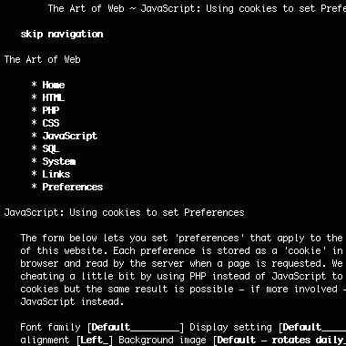
PHP code for reading cookies
In the PHP code that displays the template for this website we add the following code to the HEAD of the HTML page (inside the STYLE tags).
Links
Links
The following links/websites are ones that we have found useful in development websits and understanding new standards. We've also added links throughout this website to resources that are relevant to specific articles.1. HTML
- The Web Robots Pages
- W3C Markup Validation Service
- WDG HTML Validator
- World Wide Web Consortium (W3C)
2. CSS
- A List Apart
- CSS3.info
- css Zen Garden: The Beauty in CSS Design
- Meyerweb
- Position Is Everything
- Validate Your Style Sheet
- W3C: Cascading Style Sheets
- W3Schools
3. JavaScript
4. PHP
5. SQL
- MySQL: The world's most popular open source database
- PostgreSQL: The world's most advanced open source database
6. System
- Apache HTTP Server Version 1.3 Documentation
- Debian Linux
- Fail2Ban
- ImageMagick: Convert, Edit, and Compose Images
- The Webalizer
7. Useful Links
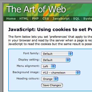
JavaScript code for setting cookies
First we have some generic code that will set a cookie with a given name and value. In this example we've set the expiry date (when the cookie will be removed from your browser) to 30 days and all cookies will be set with a path value of '/' (the root level of the website):
var today = new Date(); var expiry = new Date(today.getTime() + 30 * 86400 * 1000); // plus 30 days function setCookie(name, value) { document.cookie = name + "=" + escape(value) + "; expires=" + expiry.toGMTString() + "; path=/"; } Then comes the form handler function which is also quite simple. We first populate an associative array, prefs, with the selected name-value pairs and then loop through that array setting a cookie for each value:
var prefs = new Array(); function setPrefs(form) { prefs['fontfamily'] = form.fontfamily.options[form.fontfamily.selectedIndex].value; prefs['overflow'] = form.overflow.options[form.overflow .selectedIndex].value; for(var x in prefs) setCookie(x, prefs[x]); return true; } A better approach is to use a single cookie to hold all the values rather then one for each. The reason for this is that browsers will only hold a certain number of cookies from a domain before they start deleting the oldest. They will also only hold a certain number of cookies in total. More on that later...
System Apache
System
- Apache log files: grep, awk and other commands
- Understanding web server reports:
- mod_rewrite:
- Security:
- Analysing mailq and the mqueue directory
- Calculating Subnets
- procmail - examples
- xferlog - ProFTPD server logfile
- Apache Request and Response Headers
- Emulating an HTTP/1.1 Request using Telnet
SQL
SQL
Most of the content in this section relates to PostgreSQL, with occasional references and comparisons to MySQL. We find Postgres to be an all-round better database with the main advantages being: adherence to standards; advanced command-line interface; security; consistency; and having many functions not available in competing systems (views, constraints, arrays, date/time and geometric functions to name but a few).
PHP - Hypertext Preprocessor
PHP - Hypertext PreprocessorPHP is a widely-used general-purpose scripting language that is especially suited for Web development and can be embedded into HTML. 1. Working with text and HTML2. Data manipulation
3. File system functions4. Parsing external data sources
5. Image manipulation6. Date functions7. Security |
JavaScript Collection
JavaScript
JavaScript is NOT the same as Java. The syntax is similar but they are otherwise completely separate languages. JavaScript IS very similar to JScript - an attempt by Microsoft to avoid giving credit to Netscape during the browser wars.
1. Miscellaneous Scripts
- Escaping Special Characters
- Preventing Double Form Submission
- Protecting mailto links
- Confirming user actions
- Generating Random Numbers
- Building Menus using DHTML
2. JavaScript Cookies
3. JavaScript Form Validation
Methods for validating user input in forms using JavaScript:
- Form Validation
- Form Validation: Passwords
- Form Validation: Date and Time
- Form Validation: Credit Cards and Dates
4. Using XMLHttpRequest (Ajax)
- Web Services using XMLHttpRequest (Ajax)
- Avoiding the Race Condition with Ajax
- Form Validation using XMLHttpRequest
- Recording Outbound Links using Ajax
- Using XMLHttpRequest to log JavaScript errors
- Making sure form values are unique using Ajax
5. DHTML Sorting
Now that the major players in the browser world have agreed on a DOM, we can finally start to do some useful things with DHTML. The following pages implement dynamic sorting of elements in an already-loaded HTML document:
CSS:Linear gradients syntax
Having just worked through the differences in radial gradients syntax between WebKit and Firefox I thought that the linear gradients would be simpler, but apparently that's not the case. While WebKit has a standard syntax for both types of gradient, Firefox uses completely different approaches for linear as opposed to radial gradients.
1. Syntax for CSS Linear Gradients
Here you can see the basic syntax which will work in Safari 4 (WebKit) and Firefox 3.6a (Gecko) browsers:
background: -webkit-gradient( linear, , , from(), to() ); background: -moz-linear-gradient( , , ); You can see already from the difference in syntax that the Firefox linear gradient implementation is slightly more limited. You can only specify a single point (or angle) and the gradient will start from there and move to the opposite side/corner.
The WebKit syntax lets you specify specific points for the gradient to start and end. Before and after these points the first/last colours will continue.
2. Basic linear gradient examples
Here we have a simple example with the gradient starting in the top left corner of the box with white and ending at the bottom right corner with black:
background: -webkit-gradient( linear, 0 0, 100% 100%, from(white), to(black) ); background: -moz-linear-gradient( top left, white, black ); Often with background gradients you will want them to appear only at the edge of the element so as not to obscure any text or images. To do this in WebKit we just move the start point to somewhere further across (down) the element. For Firefox, however, we can use the trick of repeating the first colour as shown here:
background: -webkit-gradient( linear, 0 50%, 0 100%, from(white), to(lightblue) ); background: -moz-linear-gradient( top, white, white, lightblue ); The results are more or less identical in both browsers. Again, you need to be using either Safari 4 (including iPhones) or Firefox 3.6a (alpha release) to be seeing these effects.
3. Adding more colours to the gradient
To add intermediary colours WebKit uses the same method as for radial gradients with the color-stop syntax. Different colours can be inserted at points along the gradient with from() and to() being equivalent to color-stops at 0 and 1.
In Firefox it seems that the gradient always covers the entirety of the element, but they've introduced a short-hand to replace the color-stops, allowing us to achieve similar effects. Colours listed without placement information are evenly distributed over the remaining space, as you can see below:
background: -webkit-gradient( linear, 0 50%, 0 100%, from(white), color-stop(0.5, yellow), to(red) ); background: -moz-linear-gradient( top, white 50%, yellow, red ); Again, the results are more or less identical in the two browsers.
4. Repeating/tiling linear gradients
In WebKit we're able to tile the background gradient by defining it's dimensions. In this case we have a diagonal gradient from white to lightblue that has been repeated 10 times across the element:
background: -webkit-gradient( linear, 0 0, 100% 100%, from(white), to(lightblue) ); -webkit-background-size: 10% 100%; Firefox allows for something slightly different. Rather than tiling a slice of the gradient, the gradient can be repeated to infinity. here you can see how that works:
background: -moz-repeating-linear-gradient( -45deg, white 0, lightblue 10% ); And for the browser-impaired here are the screenshots from Safari 4 and Firefox 3.6a. You can see that their implementations are quite different:


5. Related Articles
CSS: Radial gradients syntax
In this articles we're going to explore the various properties of radial gradient backgrounds as implemented by the WebKit and Gecko rendering engines. Gradients can used as backgrounds, pseudo-images and image masks among other things.
The -webkit styles work already in Safari 4 and the -moz equivalents in Firefox 3.6a. As always, there are slight differences in the syntax as the CSS3 standards have not been finalised.
Important: Just as this article was completed Firefox decided to completely change their radial-gradient syntax with all kinds of bizarre new options. We're waiting for the dust to settle before updating this page. In the meantime only the WebKit examples on this page will work properly.
1. Syntax for CSS Radial Gradients
The basic syntax we will be working with is as follows:
background: -webkit-gradient( radial, , , , , from(), to() ); background: -moz-radial-gradient( , , , , from(), to() ) no-repeat; The first point and radius define the inner circle of the gradient. Inside the specified area the from() colour will be displayed. The second point and radius define the outer circle. Outside of this area you will see the to() colour. In between these two circles the gradient will be applied.
The point and radius values can be either a percentage or a pixel measurement (in WebKit without the usual px unit appended). In Firefox the default is for the background to repeat.
In the code box below we have added a radial gradient centred around a point 500 pixels across and 25% down. The inner circle (solid blue) has a radius of 20px and the outer radius (defining the end of the gradient) has a radius of 40px:
background: -webkit-gradient( radial, 500 25%, 20, 500 25%, 40, from(blue), to(#eee) ); background: -moz-radial-gradient( 500px 25%, 20px, 500px 25%, 40px, from(blue), to(#eee) ) no-repeat; As expected, if your browser supports it, you will see a solid blue circle with a radius of 20 pixels, surrounded by a blue-to-gray gradient extending outwards a further 20 pixels.
In the following sections we're going to modify different variables so you can see the effect they have.
2. Changing the radius of the inner circle
In the examples below we are changing the radius of the inner circle from 0 to 50 pixels in 10-pixel increments. You will see the solid portion of the gradient getting larger. When the two circles are identical, however, there is no gradient and the -webkit-gradient style is nullified and the default background colour takes over.
When the inner circle is larger (the last example) the gradient is inverted going from grey to blue instead of vice-versa. That makes sense as swapping the two circles around has the same effect as swapping the from() and to() colour settings.
background: -webkit-gradient( radial, 500 25%, 0, 500 25%, 40, from(blue), to(#eee) ) yellow; background: -moz-radial-gradient( 500px 25%, 0px, 500px 25%, 40px, from(blue), to(#eee) ) yellow no-repeat; background: -webkit-gradient( radial, 500 25%, 10, 500 25%, 40, from(blue), to(#eee) ) yellow; background: -moz-radial-gradient( 500px 25%, 10px, 500px 25%, 40px, from(blue), to(#eee) ) yellow no-repeat; background: -webkit-gradient( radial, 500 25%, 20, 500 25%, 40, from(blue), to(#eee) ) yellow; background: -moz-radial-gradient( 500px 25%, 20px, 500px 25%, 40px, from(blue), to(#eee) ) yellow no-repeat; background: -webkit-gradient( radial, 500 25%, 30, 500 25%, 40, from(blue), to(#eee) ) yellow; background: -moz-radial-gradient( 500px 25%, 30px, 500px 25%, 40px, from(blue), to(#eee) ) yellow no-repeat; background: -webkit-gradient( radial, 500 25%, 40, 500 25%, 40, from(blue), to(#eee) ) yellow; background: -moz-radial-gradient( 500px 25%, 40px, 500px 25%, 40px, from(blue), to(#eee) ) yellow no-repeat; background: -webkit-gradient( radial, 500 25%, 50, 500 25%, 40, from(blue), to(#eee) ) yellow; background: -moz-radial-gradient( 500px 25%, 50px, 500px 25%, 40px, from(blue), to(#eee) ) yellow no-repeat; If you're wondering what the yellow is doing there it's simply a background colour. The gradient takes the place of a url() statement that would include an image file. Effectively the gradient becomes an image that then sits on top of the background colour.
3. Changing the position of the inner circle
This is where it starts to get trickier. While the inner circle fits inside the outer circle there is no problem. The gradient is simply squashed on one side and stretched on the other.
It's when the edges touch or cross over that you start to see strange effects. In these cases an 'arrow' is formed using the points of intersection of the two circles and the furthest point of the inner circle. Outside of that arrow the default background is visible.
background: -webkit-gradient( radial, 490 25%, 20, 500 25%, 40, from(blue), to(#eee) ) yellow; background: -moz-radial-gradient( 490px 25%, 20px, 500px 25%, 40px, from(blue), to(#eee) ) yellow no-repeat; background: -webkit-gradient( radial, 480 25%, 20, 500 25%, 40, from(blue), to(#eee) ) yellow; background: -moz-radial-gradient( 480px 25%, 20px, 500px 25%, 40px, from(blue), to(#eee) ) yellow no-repeat; background: -webkit-gradient( radial, 470 25%, 20, 500 25%, 40, from(blue), to(#eee) ) yellow; background: -moz-radial-gradient( 470px 25%, 20px, 500px 25%, 40px, from(blue), to(#eee) ) yellow no-repeat; background: -webkit-gradient( radial, 460 25%, 20, 500 25%, 40, from(blue), to(#eee) ) yellow; background: -moz-radial-gradient( 460px 25%, 20px, 500px 25%, 40px, from(blue), to(#eee) ) yellow no-repeat; background: -webkit-gradient( radial, 450 25%, 20, 500 25%, 40, from(blue), to(#eee) ) yellow; background: -moz-radial-gradient( 450px 25%, 20px, 500px 25%, 40px, from(blue), to(#eee) ) yellow no-repeat; When the inner circle is larger than the outer, the effect is reversed, just as in the previous examples:
background: -webkit-gradient( radial, 450 25%, 40, 500 25%, 20, from(blue), to(#eee) ) yellow; background: -moz-radial-gradient( 450px 25%, 40px, 500px 25%, 20px, from(blue), to(#eee) ) yellow no-repeat; 4. Adding more colours to the gradient
As with the linear gradients it's possible to insert more colours and 'color-stop' points. A color-stop specifies a colour for the gradient to 'hit' at a given point between 0, the inner circle of the gradient (equivalent to from()), and 1, the outer circle (equivalent to to()).
Here we have a gradient that transitions from orange to white to light blue. All that is changing between each example is the point at which the first transition is completed and the second one begins:
background: -webkit-gradient( radial, 500 50%, 10, 500 50%, 80, from(orange), color-stop(0.2, #fff), to(lightblue) ); background: -moz-radial-gradient( 500px 50%, 10px, 500px 50%, 80px, from(orange), color-stop(0.2, #fff), to(lightblue) ) no-repeat; background: -webkit-gradient( radial, 500 50%, 10, 500 50%, 80, from(orange), color-stop(0.4, #fff), to(lightblue) ); background: -moz-radial-gradient( 500px 50%, 10px, 500px 50%, 80px, from(orange), color-stop(0.4, #fff), to(lightblue) ) no-repeat; background: -webkit-gradient( radial, 500 50%, 10, 500 50%, 80, from(orange), color-stop(0.6, #fff), to(lightblue) ); background: -moz-radial-gradient( 500px 50%, 10px, 500px 50%, 80px, from(orange), color-stop(0.6, #fff), to(lightblue) ) no-repeat; background: -webkit-gradient( radial, 500 50%, 10, 500 50%, 80, from(orange), color-stop(0.8, #fff), to(lightblue) ); background: -moz-radial-gradient( 500px 50%, 10px, 500px 50%, 80px, from(orange), color-stop(0.8, #fff), to(lightblue) ) no-repeat; And of course we can insert more colours:
background: -webkit-gradient( radial, 500 50%, 20, 500 50%, 100, from(red), color-stop(0.2, orange), color-stop(0.4, yellow), color-stop(0.6, green), color-stop(0.8, blue), to(#fff) ); background: -moz-radial-gradient( 500px 50%, 20px, 500px 50%, 100px, from(red), color-stop(0.2, orange), color-stop(0.4, yellow), color-stop(0.6, green), color-stop(0.8, blue), to(#fff) ) no-repeat; One final trick which you can try out yourself. If you define two color-stops at the same point then that will become a hard edge rather than a gradient.
5. Using radial gradients as image masks
Now to something potentially more interesting for designers and developers, applying radial gradients as image masks using alpha transparency. These effects will currently work only in WebKit browsers.
 | | |
| no style settings | -webkit-mask-image: -webkit-gradient( radial, 50% 50%, 30, 50% 50%, 90, from(#fff), to(rgba(0,0,0,0))); | -webkit-mask-image: -webkit-gradient( radial, 50% 50%, 70, 50% 50%, 90, from(#fff), to(rgba(0,0,0,0))); |
In the above examples the from() and to() colours are not important. It's only the alpha transparency that effects the image mask properties. The radius of the outer circle has been set to half the width of the photo and the two examples show the effects of a small and a large inner circle respectively.
For the browser-impaired, here's how the image mask effect renders in Safari 4:

6. Repeating radial gradient backgrounds
In Firefox having the gradient repeat is the default behaviour. Just leave off the no-repeat instruction in the above examples and you will see the gradient pattern repeat - both outwards and inwards.
Here you can see a simple gradient with no repetition. We've offset the inner and outer circles so you can see how that effects the repeated gradient:
background: -moz-radial-gradient( 500px 50%, 10px, 460px 50%, 80px, from(orange), color-stop(0.2, #fff), to(lightblue) ) no-repeat; and with repeat enabled:
background: -moz-radial-gradient( 500px 50%, 10px, 460px 50%, 80px, from(orange), color-stop(0.2, #fff), to(lightblue) ); For those not using Firefox 3.6a or higher, here's a snapshot:

In WebKit it's a whole different story. There doesn't seem to be an option to have the gradient continue in the same fashion as Firefox (and quite some discussion as to what is 'proper' behaviour). Instead you can create a repeating tile by setting boundaries for the gradient background, effectively creating an image tile:
background: -webkit-gradient( radial, 500 50%, 10, 500 50%, 80, from(orange), color-stop(0.2, #fff), to(lightblue) ); -webkit-background-size: 100% 33%; The -webkit-background-size option defines a box attached to the top left of the surrounding element. In this case we've set the dimensions to be 100% of the width and 33% of the height. The contents of this box are then automatically tiled to completely fill the element, as you can see in this screenshot from Safari 4:

To make it clearer what's happening, here's an example where we tile the background gradient horizontally by setting it's width to 25%:
background: -webkit-gradient( radial, 120 50, 10, 120 50, 40, from(white), color-stop(0.1, #c93), color-stop(0.3, pink), color-stop(0.6, pink), color-stop(0.9, #c93), to(white) ); -webkit-background-size: 25% 100%; And a preview for those not using Safari 4 or higher:

Mmmmm donuts...
CSS: Transition Timing Functions
This article follows on from the related article on Animation using CSS Transforms and investigates the transition-duration and transition-timing-function properties which control, respectively, the duration and speed at which a transition is carried out.
The examples on this page will currently only work if you download a WebKit Nightly Build web browser now work in Safari 5, Chrome 6, Opera 10 and Firefox 4 Beta. They will not work in Internet Explorer.
1. Transition Timing Function Options
The transition-duration property is simple to understand. It defines the total duration of a transition from state A to state B, whether the transition involves scaling, distorting, rotating or modifying the style of an element.
The transition-timing-function is more difficult as it defines the rate at which the transition is carried out, which can involve speeding up and slowing down. It's all got something to do with Bézier curves as described here:
The transition-timing-function property describes how the animation will proceed over time. Keywords can be used for common functions or the control points for a cubic bézier function can be given for complete control of the transition function.
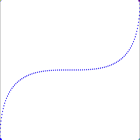
Rather than trying to work out what all that means, lets look at the keyword values for this property and how they affect a simple translation across the page. Move your mouse over the field below and the green boxes should all take off in a race across the page.
Each box undergoes the same transformation, but they all use different transition timing functions as shown by their labels. These are explained in more details below.
| default » linear » ease-in » ease-out » ease-in-out » cubic-bezier » You can certainly see the effect of different transition timing functions on the animation. Of the named functions the ease-out box is fastest out of the blocks with ease-in lagging at the back. The default setting seems to be a slightly accelerated version of ease-in-out. And all of them complete the trip at more or less the same 2 seconds. The cubic-bezier option let's you specify your own curve by defining two points. The curves used for the above display are illustrated in the next section, apart from linear which I hope speaks for itself. 2. What are Bézier Curves?The model used to generate different timing functions is based on cubic bézier curves which are described in the Surfin' Safari blog as follows: To specify a cubic bezier function, you give an X and Y values for 2 of the control points of the curve. Point P0 is implicitly set to (0,0) and P3 is implicitly set to (1,1). These 4 points are used to compute a cubic bezier curve. In the same article they provide the values used to generate the 'named' options which allow us to illustrate the different curves. Below each graph you can see the name of the timing function and the coordinates of P1 and P2 used to plot the curve. For the last curve we've defined the coordinates ourselves using the cubic-bezier option:
The mechanics of Bézier curves are described in detail on Wikipedia as follows: Four points P0, P1, P2 and P3 in the plane or in three-dimensional space define a cubic Bézier curve. The curve starts at P0 going toward P1 and arrives at P3 coming from the direction of P2. There's a bit more to it than that of course as you can find out on that page, but what's important is that you see how the five graphics above match the movements of the five boxes in the previous section. The x-axis represents time and the y-axis the displacement (horizontal in this case). These graphs have been generated using BezierText 1.0.1 (freeware) for OSX 3. Now available in SafariAs of Safari 3.1 (March 2008) these CSS properties are now recognised by default so they work for all up-to-date OSX users. So brace yourself - this could be the scariest addition to the web since animated backgrounds! 4. Image Fade and Special Effects using CSSHere's an interesting use for CSS transitions - a dynamic fade from one photo to another. When you mouseover the photo of Hilary it will fade gracefully into a photo of Barak. Move the mouse away and the transition is repeated in reverse.   Here are the styles used for this effect (no JavaScript required): Here's another interesting effect - a progress bar that counts off 5 seconds in half-second intervals. To start the animation, put your mouse over the line of boxes and wait.
Again, this is achieved using no JavaScript and very little CSS. It's a bit of a hack, but surprisingly effective: Note: to get these examples working in Opera you need to use the -o- prefix instead of (as well as) -webkit-. For Firefox the prefix will be -moz-. So what do you think? Is this the 'Flash killer' that we've been waiting for? |

CSS: Animation
CSS: Animation Using CSS Transforms
The examples on this page will work properly in Safari and Chrome and Opera. In the latest Firefox release you will see the transforms, but without any animation (if you want to see the animations in Firefox you can now download Firefox Beta 4). If you're still using Internet Explorer nothing on this page will make much sense.
The implementation of animation in CSS involves setting up a transformation to take place in response to a mouseover or other event. Then, rather than applying the effect instantly, we assign a transition timing function which applies the transformation/s over a set time period.
Update: All examples on this page will work in Safari 5, Chrome 6, Firefox 4 Beta and (with a few quirks) Opera 10.
1. Introducing CSS Transformations
The effect of a CSS Transform is to modify the appearance of an element in the browser by translating, rotating or other means. When defined in a style sheet the transform is applied before the page is rendered, so you don't actually see any animations. Transforms can also be applied as a mouseover or similar effect which you can see in the next section.
Apple's proposal for CSS Transformations calls for the ability to change the perspective and work in three dimensions, but that's some way away yet. Even the features demonstrated here won't appear in other browsers until they're approved by the standards body who are still quibbling over CSS3 modules.
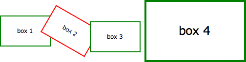
Below we've placed four identical DIV's styled as a 100 x 60 pixel box with a 2 pixel green border. Subsequently, each element has been transformed in some way using the -webkit-transform property as follows:
Updated: Firefox and Opera now support these transforms with an identical syntax. Just replace -webkit with -moz and/or -o in the examples below and you will see the same effects.
| box 1 | Translated to the right: -webkit-transform: translate(3em,0); |
| box 2 | Rotated 30 degrees with the clock: -webkit-transform: rotate(30deg); |
| box 3 | Translated to the left and down slightly: -webkit-transform: translate(-3em,1em); |
| box 4 | Scaled to twice it's original size: -webkit-transform: scale(2); |
| box 1 box 2 box 3 box 4 Without the translations, and the red border on the second box, you would see just four identical boxes labelled one through four. What you see in supported browsers (Safari, Chrome, Firefox, Opera), however, will be more like this:
Of note is the fact that the text is still selectable in transformed elements, even when rotated, and that scaling an element affects other properties including border widths and font sizes and not just the dimensions. 2. Animating your TransformsWhile CSS Transformation in itself is a powerful tool for developers (though I shudder to think what would happen if it was more widely available), the ability to animate the same effects using -webkit-transition is far more exciting. Move your mouse over the following four boxes for a demonstration: box 2 box 4 What you see above is the four boxes from the previous section, in their default states. When you mouseover any of the boxes, however, the CSS transformation is applied as a one second animation. When the mouse moves away the animation is reversed, taking each box back to it's starting position and state. And we can achieve all this using nothing other than HTML and CSS! If you think that's cool, realise that CSS Animation can be applied not just to the transforms, but also to other CSS properties including: opacity, colour and a bunch of other properties. In the next example the box on the left begins as small and green with square corners, while the one on the right is larger, with a red border and rounded corners. Hovering over either of the boxes will trigger an animation that makes box 1 take on the appearance of box 2 and vice versa. Activating transforms using :hover is supported in Firefox, but it isn't yet possible to control the timing of the effects using transitions, instead the element moves or changes immediately. box 1 box 2 Again, we're still only using HTML and CSS to make this happen. Stay tuned for more advanced examples using JavaScript to control the animation. Without CSS Transforms the two boxes will still change their border-color, and possibly also the border-radius, but it happens immediately rather than as a one second animation. 3. Multiple Transforms on one elementTo apply more than one transformation to a single element simply list them one after another separated by spaces. The submenu for example at the top right of this page has the following styles: This means that when you hover over the submenu, it will change colour, rotate and double in size over a period of one second as shown here:
These effects are now available in the latest public release of Safari, so in principle all OSX users will be able to see these effects. Whether it's a good idea to add them to your website I'll leave up to you. Update: Thanks to misterbisson those without WebKit can now see a screencast of the menu animation: 4. Animations in actionNow here's another example of the kind of fun we can have in combining different effects into single animation. Perhaps you can already work out what's going to happen based on the CSS?  If you're using Safari 3 you may notice some problems with the animation, particularly when it reverses after you move the mouse away, but in the latest version of WebKit it's already much smoother. Also the animation in Opera is a bit erratic, with not all the elements being animated. The dotted outline that appears during the animation shows the placement of the DIV containing the rocket image. This DIV translates across the screen while the image inside is rotated. Simple! For the browser-impaired what's happening is that when you move the mouse over the space background, the rocket translates from the bottom left to the top right over a period of 3 seconds (translate()) and also rotates 70 degrees in a clockwise direction over the first 2 seconds (rotate()). The effect is rudimentary, but shows the potentional. |
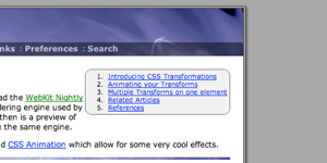
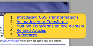
CSS: Screenshots of The Art of Web
CSS is a great tool for reducing the amount of HTML required and creating visual effects that would otherwise be impossible. The problem is and has always been that different browsers have different levels of support for CSS1, 2 and 3 selectors and styles. There are even CSS properties that only work in a single browser or family of browsers.
This website was designed and built to look good in the Safari and Firefox web browsers and one day Internet Explorer will catch up (maybe).
1. Safari 2.0
Safari supports the opacity and text-shadow properties and uses Aqua to render form elements. This is how the website was designed to look:
2. Firefox 1.5 (Mac)
Firefox supports opacity but not text-shadow. It also has a proprietory -moz-border-radius property as you can see by the rounded corners on the fieldset and submit button:
3. MSIE 5.2 (Mac)
Internet Explorer (Mac) is no longer a supported browser - in other words it's never going to get better than it is now. There's no support for opacity, text-shadow or even the ::before and ::after pseudo-elements that are used to insert the separators in the navigation bar.
The site will look very similar in Internet Explorer (Windows), the most common browser in all meanings of the word.
4. Opera 8.51 (Mac)
Opera, as always, falls somewhere in between. It has support for the pseudo-selectors which are CSS2 but not for opacity which is (will be) CSS3. It supports formatting of form elements but not rounded corners. The form again has a different appearance:
5. Lynx 2.8.4 (Darwin)
Then there's the fascinating if limited world of text-only browsers:
If web design is your business then you need to know about these differences and how to make a design work in all the different browsers. A site that only works in Internet Explorer (Windows) will earn little respect from users of other browsers or platforms.
CSS: Formatting a Definition List
With the comeback of 'semantic markup' people are once again looking at what's the right tag to be using for different types of information. For example, unordered lists for navigation and tables only where absolutely necessary. One commonly overlooked option for markup of glossaries and definition lists is the dl attribute itself.
1. The Definition List (DL)
We know what the basic DL output looks like - not very attractive - which is why they are rarely used by webmasters. Here you can see an unformatted list with some sample content:
- first item
- definition for first item in list
- second item
- definition for second item in list
extending across more than one line - third item
- definition for third item in list
There are two options for adding some formatting. The first is to start adding HTML tags such as for the 'data term' (dt) and maybe a smaller font size, or italics for the 'data definition' (dd). But we can do all that and more much better using CSS.
2. Example 1
Let's start with some simple CSS styles:
dt { font-weight: bold; text-decoration: underline; } dd { margin: 0; padding: 0 0 0.5em 0; } Our simple list now looks a bit different. The indenting has been removed, some vertical padding inserted, and the data terms have been bolded and underlined:
- first item
- definition for first item in list
- second item
- definition for second item in list
extending across more than one line - third item
- definition for third item in list
That's a move in the right direction, but probably still not enough to convince people of the merits of this approach. The following example should prove more persuasive.
3. Example 2
In the first example we were just tinkering at the edges of what's possible using CSS. This example uses slightly more advanced code to further enhance the appearance of the list:
dl { border: 3px double #ccc; padding: 0.5em; } dt { float: left; clear: left; width: 100px; text-align: right; font-weight: bold; color: green; } dt:after { content: ":"; } dd { margin: 0 0 0 110px; padding: 0 0 0.5em 0; } The list now appears as if the items were placed in a table:
- first item
- definition for first item in list
- second item
- definition for second item in list
extending across more than one line - third item
- definition for third item in list
Even the most sceptical webmaster should now be starting to re-think their position.
4. Advantages of CSS formatting over HTML
So why are we doing this again? There are a number of reasons:
- separation of content from formatting
- this is the 'holy grail' for css programmers. As illustrated by sites such as css Zen Garden, separation means that the look and feel of a site can be drastically altered without changes to the underlying HTML code.
- optimised for search engine spiders
- it pays to be friendly to spiders as they're the only way to get your site to appear in search engine result pages (SERPs). The more advanced spiders are now starting to pay attention to how content is marked up and how that information can be incorporated into their search algorithms.
- saves bandwidth
- you also reduce the amount of HTML required each time a list is presented. If the CSS is sourced from an external file then it only has to download once and the browser can use a cached version for subsequent pages.
It might take some time to 'clean up' your existing HTML code and convert lists and other elements to CSS but the advantages now and ongoing make it worthwhile.
CSS : Tables
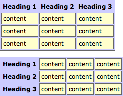
CSS: Tables: border-collapse: collapse
The CSS2 border-collapse property allows you to quickly create formatted tables using plain HTML markup.
Here is a sample CSS snippet that contains all you need to format tables with any range of colours, borders and other effects:
table { border-collapse: collapse; } tr { border: 1px solid #666; } th { background-color: #ccf; border: 1px dotted; text-align: left; } td { border: 1px dotted; background-color: #ffc; vertical-align: top; }
Essentially, setting the border-collapse property to collapse allows borders to be applied to TR's and TD's in ways that aren't possible using CSS1.
The styles above have been applied to two tables below. The tables are marked up using nothing fancier than TH (for headings) and TD (for content). The cellpadding is defined in the HTML but could just as easily be set using CSS.
Heading 1 Heading 2 Heading 3
content content content
content content content
content content content
Heading 1 content content content
Heading 2 content content content
Heading 3 content content content
this is how it should appear:
Using the standard TABLE model would require twice as much code, as you'd have to set the background colours, borders and text alignment for each row or cell.
You might want to pay special attention to the section on Border conflict resolution in the W3C specifications. It explains how precedence is determined when borders belonging to different elements overlap.
To summarise, a border that appears 'more solid' will override one that is 'less solid' with the exception of those that are 'hidden'. That explains why, in our example, the solid borders around the rows over-ride the dotted borders around cells.
If your browser renders the above tables differently than the sample provided, it probably isn't following these rules.
Once you've set the border-collapse property of a table to collapse, you can add individual borders to any rows or cells in that table. Here's a small demonstration:
1 2 3
4 5 6
7 8 9
You should be seeing a red square inside a yellow one. There will also be a partial green box around the '9', but as it's a 2px border, it is overruled by the other, 3px, borders (see 'border conflict resolution' above).
CSS: Tables: border-collapse: separate
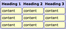
The CSS2 border-collapse property allows you to quickly create formatted tables using plain HTML markup.
Here is a sample CSS snippet that contains all you need to format tables with any range of colours, borders and other effects:
table { border-collapse: separate; border: 1px solid #666; background-color: #ccf; } th { text-align: left; } td { border: 1px solid #666; background-color: #ffc; } Essentially, setting the border-collapse property to separate allows borders to be applied to table cells in ways that aren't possible using CSS1.
The styles above are applied to two tables below that are marked up using nothing fancier than TH (for headings) and TD (for content). The cellpadding and cellspacing values are defined in the HTML, but could also be set using CSS.
| Heading 1 | Heading 2 | Heading 3 |
|---|---|---|
| content | content | content |
| content | content | content |
| content | content | content |
| Heading 1 | content | content | content |
|---|---|---|---|
| Heading 2 | content | content | content |
| Heading 3 | content | content | content |
this is how it should appear:
This kind of layout is not possible using the standard TABLE model.
1. Combining border-collapse with other properties
This last example combines the 'separated' table model with the experimental border-radius property:
| Heading 1 | Heading 2 | Heading 3 |
|---|---|---|
| content | content | content |
| content | content | content |
| content | content | content |
this is how it should appear:
Note: As explained on the border-radius page this will work in the Mozilla browsers (Firefox, Netscape et al) and not in Internet Explorer.
Subscribe to:
Comments (Atom)